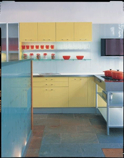
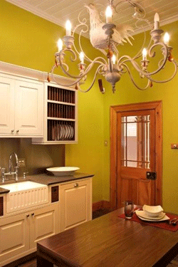
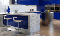
 Colour can be a very valuable design tool, holding the power to make a room truly spectacular. Colour can completely change a room – it can impact on the visual appearance of size, shape and appearance of the room, and even modify its atmosphere. With so many influences, it is important to carefully consider which colours to use in your kitchen to get the colour mix just right.
How colour can affect a room
Cool, light or muted tones can make a room appear larger than it actually is. Using these colours will lengthen a room and make a ceiling appear higher – opening the area up and creating the illusion of added spaciousness. Warm and darker tones on the other hand, will make a space seem smaller. Although these tones set a cosy atmosphere, they ought to be used sparingly, and if used as accent colours for example, darker colours can give a room much needed depth.

Choosing the colours
The best way to choose your kitchen's colour scheme is to use the colour wheel. There are three main colour schemes, namely:
• The monochromatic colour scheme: uses only one colour, but includes various tints, tones and shades of that particular colour.
• The complimentary colour scheme: Uses two colours that are placed opposite each other on the colour wheel, such as red and green for example. This kind of scheme is quite intense and brings a more dramatic touch and energy to a room.
• The analogous colour scheme: This kind of colour scheme includes three hues placed adjacent to each other on the colour wheel, with either warm or cool colours in combination, such as yellow and green, blue and violet, or red and orange for example.
When choosing colours, be sure to keep in mind that various colours can influence your moods in certain ways. For example, studies have shown that the colour red can quicken your pulse and breathing rate and increase your appetite. Yellow, especially softer, muted yellows, can liven up a space and give it a fresh and cheerful appearance. Blue is said to calm the nervous system and create a peaceful and comfortable ambience.
 Another great way of choosing your colour scheme is to use Mother Nature as your inspiration. There are literally endless colour schemes found in nature – for example, sky blue complemented by muted green and a light stone colour makes for a great colour palette. A strawberry-inspired colour palette of red and green is striking and dramatic, or alternatively, a pear-inspired palette of soft yellows and greens will make for a calming ambience. Keep your eyes peeled for natural inspirations, as they work well together and offer risk-free combinations that have been proven to work well together.
Getting the balance right
 It is recommended that you choose one particular colour as the base colour, and two accent colours. Designers suggest that colour should be divided up into a 60-30-10 split – 60% representing the main, dominant colour, probably on the walls or cabinets, 30% representing the secondary colour, used for flooring or countertops for example, and 10% representing the colour used for accents, such as dishes, artwork, window dressing and other accessories. Following this rule will provide your kitchen with balance and proportion, while preventing one particular colour from overpowering the space.
Think about longevity
 It is a wise idea to think about how long your particular choice of colour scheme will remain trendy and up-to-date. Colour schemes can become tired and dated fairly quickly, and so it is a good idea to consider this when you are designing your kitchen. For example, it would be a wise choice to choose neutral tiling and cabinets options, and accent your kitchen with colour by including colourful painted walls, artwork, blinds, kitchen accessories and possibly a bright countertop. In this way, if you get tired of your colour scheme, you can change it without having to redo your entire kitchen. This is an especially wise consideration if you are considering your home's resale value, as your particular choice of colour might not appeal to a wide audience, and a neutral colour scheme will.
Pictures
Images courtesy of:
- Cucina Design
- Easylife Kitchens
- Reto Kitchens
- The Kitchen Clinic
- Vetrazzo: Picture courtesy of Joel Puliatti, ©2008 Joel Puliatti for Vetrazzo,
For more information contact click here to visit the Cucina Design website.
For more information contact click here to visit the Easylife Kitchens website.
For more information contact click here to visit the Reto Kitchens website.
For more information contact click here to visit the The Kitchen Clinic website.
For more information contact click here to visit the Vetrazzo website.
Property News
Click here for more property news articles.
Need a blog?
Start your own blog with a free blog from 24.com.


